Everyday stories nin / shinobu
A final check before printing words that matter
Review wording, letterforms and placement separately before approving a small print project. Keep the approved version easy to identify.
Wear this characterStart with a scene
A name, a date or a short phrase can look so familiar that you stop reading it. Before approving a card, poster or personal design, separate the checks. First compare the wording with the intended source: spelling, punctuation and the exact date. Then inspect the layout. Asking “Does this look good?” combines too many decisions and makes it easy to discuss the colour while overlooking a wrong letter.
A closer look
Give each check a different job
For a language you do not know well, get the wording and meaning checked by someone who does. Provide the intended use and the full phrase, not only an isolated decorative image. Do not assume that a plausible-looking character is correct. If lettering has been redrawn or transformed, compare the final artwork too; checking the original text does not establish that every later visual version still says the same thing.
View the layout at approximately its intended size. Check the edges, contrast, spacing and any areas hidden by a fold or seam. Follow the printer’s actual file and proof requirements rather than guessing them from a screen preview. Save the approved file with a clear version name, and make sure that is the file you submit. Any last-minute alteration deserves another look at the affected parts.
See it in words
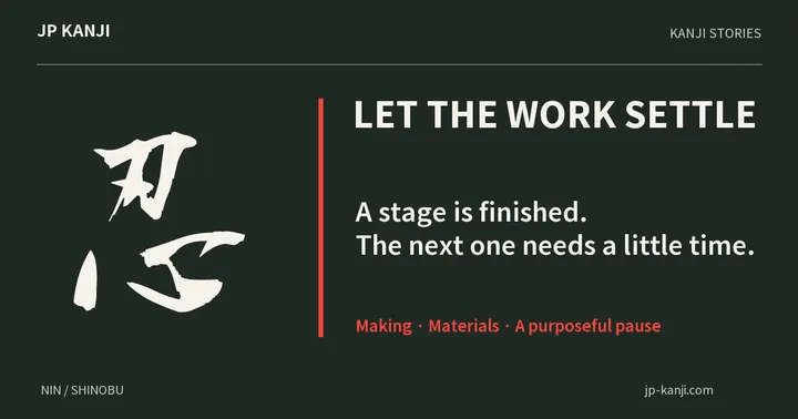
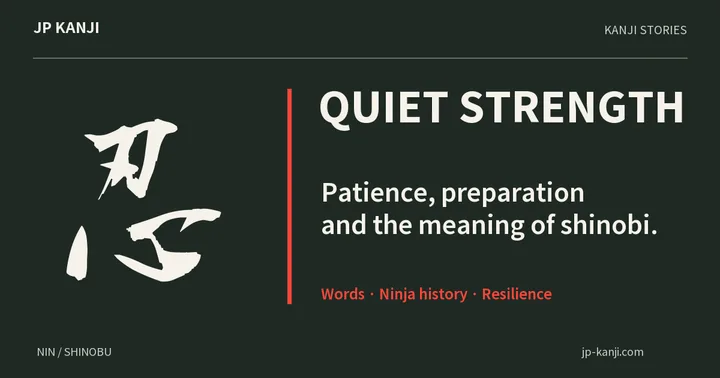
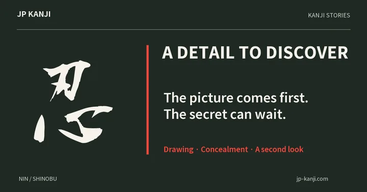
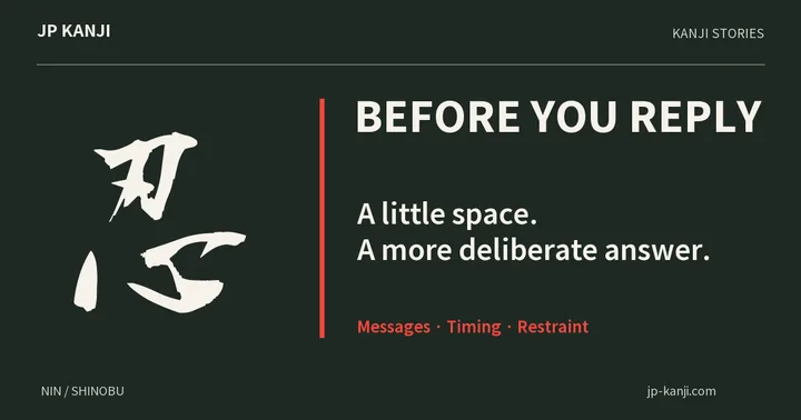
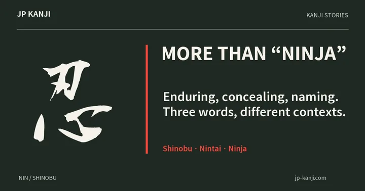
- 忍
- nin / shinobuThe character behind these words
- 忍耐
- nintaiEndurance or patience
- 忍者
- ninjaNinja
A meaning to make your own
A thought to give
A 忍 gift for someone who quietly catches details could include: “I notice the care you put into the things others might miss.” Let it recognise their effort rather than ask them to check everyone else’s work.
Make a gift cardOne more question
Is a digital preview enough to judge a printed result?
It can reveal many layout and wording issues, but screen colour, scale and material appearance have limits. Use the proof options and specifications offered by the actual printer. A correct text file and a satisfying physical result are related checks, not identical ones.
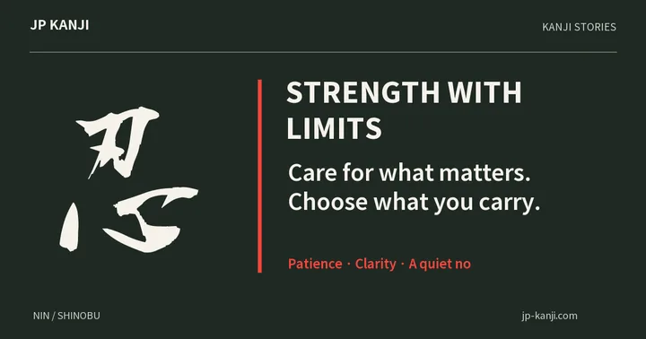
A character to carry with you 忍
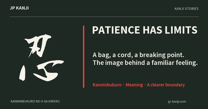
忍 is associated with endurance and restraint. The connection here is the willingness to slow down for one last careful comparison. It is an everyday interpretation of the character, not a historical printing tradition or a promise that patience removes every mistake.
Wear this character