Style & making bi / utsukushii
Choose a mat colour for an art print using paper trials
See how the border changes the picture before ordering a frame.
Wear this characterStart with a scene
A mat colour can change how an art print feels without changing the image itself. Before ordering, cut a simple window from ordinary paper and place it over a reproduction or beside the print without attaching it. Treat this as a colour trial, not as a permanent mounting material.
A closer look
Compare the border in the intended room
Compare a warm light tone, a cooler light tone and a restrained darker option if it suits the work. Look at the image's edges and its palest details. A border that seems attractive alone may make the picture look dull or compete with its strongest colour.
View the trials where the framed work will hang, under the light you usually use there. Photograph the options for comparison, but make the final judgement in person when possible. Screens and automatic camera adjustments can make two nearly similar papers appear more different than they are.
See it in words
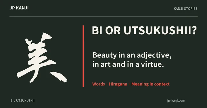
- 美
- biBeauty; read bi in many words
- 美しい
- utsukushiiBeautiful
- み
- miHiragana mi, historically linked to cursive 美
A meaning to make your own
A thought to give
A beauty-themed gift can accompany an art print, but let the recipient choose a frame for their own room. Clothing preferences deserve the same room for choice.
Make a gift cardOne more question
Should the mat match the wall?
Not necessarily. Compare the print, border and wall together. Choose the relationship you want to see, instead of matching one isolated colour sample automatically.
A character to carry with you 美
美 means beauty. The connection is the attention given to a relationship between an image and its surroundings, rather than a rule that one border is universally correct.
Wear this character