Style & making ryū / tatsu
Why bold lettering needs room around it
Try a simple framing exercise with a dense character: the blank area can change how clearly you see the whole design.
Wear this characterStart with a scene
Place a detailed drawing between two busy patterns, then beside a plain sheet. You have not changed the drawing, but you have changed what competes with it. The same experiment works when choosing how to wear a strongly shaped graphic.
A closer look
The space that lets a mark speak
Use three quick arrangements: graphic alone, graphic beside a patterned layer, and graphic framed by an open plain layer. Step back from each. Notice where your eye lands first and whether the outline remains easy to follow. This is an observation exercise, not a rule that patterns can never work together.
Now change only one thing: the gap around the design. Keeping colour and scale steady makes the comparison easier. If the garment is in front of you, look while standing and sitting; an arrangement that works flat may fold differently in use. Let the actual garment, rather than a perfect flat sketch, guide the choice.
See it in words
- 龍
- ryū / tatsuThe fuller form used in our design
- 竜
- ryū / tatsuAnother Japanese form for dragon
- 龍神
- ryūjinA dragon deity
A meaning to make your own
A thought to give
For a friend who likes graphic clothing, offer an outfit idea as an option: “I pictured this with your plain overshirt.” Their preference remains the deciding factor.
Make a gift cardOne more question
Must the rest of the outfit be minimal?
No. Try the comparison before making a rule. A patterned jacket may work well when its scale or contrast leaves the lettering easy to distinguish.
A character to carry with you 龍
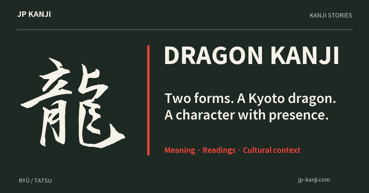
龍 names a dragon. Its dense brush form makes this spacing exercise especially easy to see. A plain surrounding layer can frame the character without adding another motif.
Wear this character