Style & making wa / nagomu
A small colour palette that still feels like you
Try two colours and one accent using clothes or objects you already own. Harmony can include a deliberate difference.
Wear this characterStart with a scene
Lay out three objects whose colours you enjoy together. Perhaps two are muted and the third is bright. The interesting part may be the difference, not a perfect match. You can use the same observation when arranging a desk, a photograph or an outfit.
A closer look
Repeat something, then change one thing
Choose one main colour, a supporting colour and an optional small accent. Do not treat those roles as a formula for every occasion. They are a way to make your first comparison readable. Change the accent while keeping the other pieces still, and notice whether the focus moves.
Look in the light where the combination will actually be used. A fabric that seems neutral in one room may look warmer beside another material. If you are styling a print, compare the whole garment rather than an isolated colour swatch. Scale, texture and the amount of each colour all contribute to what you see.
See it in words
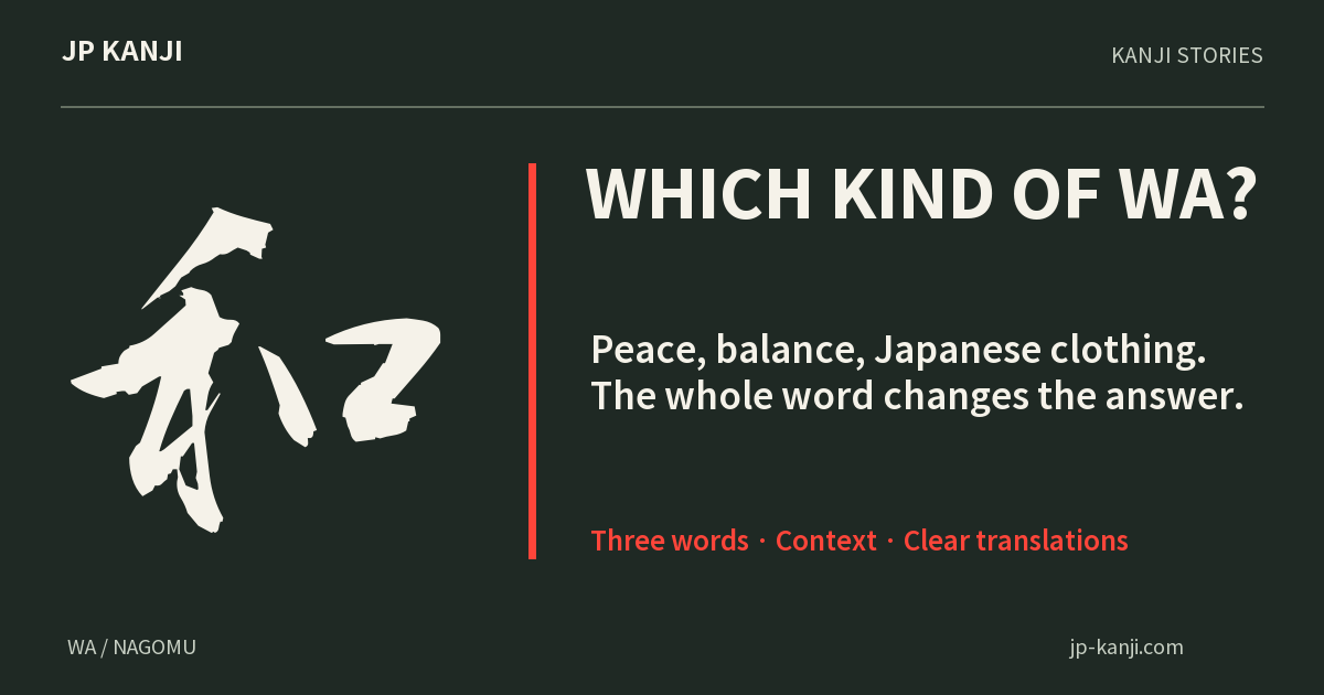
- 平和
- heiwaPeace
- 調和
- chōwaHarmony or balance
- 和食
- washokuJapanese food culture
A meaning to make your own
A thought to give
For someone whose combinations you admire: “You notice which things belong together.” Mention a room or outfit you actually remember.
Make a gift cardOne more question
Must harmonious colours be similar?
Not for this exercise. Try both a close match and a clear contrast. Choose the relationship you enjoy seeing rather than assuming that harmony requires sameness.
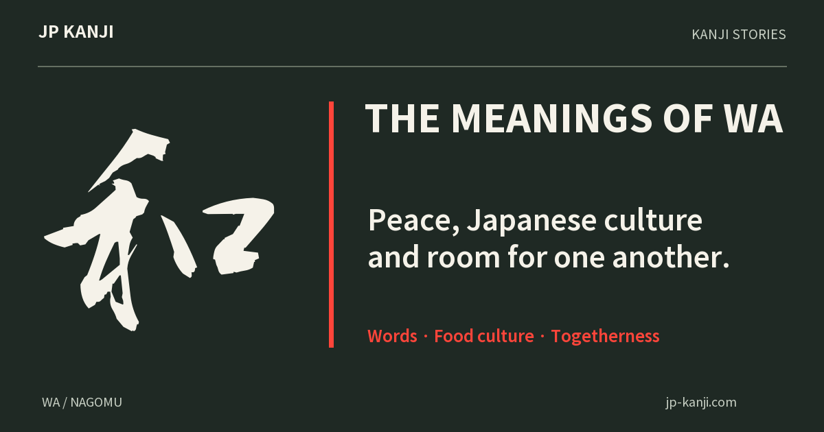
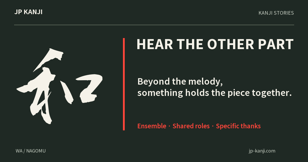
A character to carry with you 和
和 can express harmony or fitting together. As a personal design choice, it can accompany a palette where different parts support a whole while keeping their own character.
Wear this character